Những đoạn code tùy biến cho VSCode cực đẹp bởi Evondev (Phần 1)
Tác giả: Trần Anh Tuấn
Từ trước tới giờ mình tùy biến VSCode rất nhiều và cũng có nhiều người hỏi về các đoạn code tùy biến đó, người này hỏi, người kia hỏi cho nên mình viết luôn bài này tổng hợp code những cái tùy biến đấy cho các bạn luôn.
Trước khi mà các bạn có thể áp dụng được những đoạn code này vào thì các bạn cần xem video này trên kênh Youtube của mình để có thể hiểu cách làm nhé:
Tùy biến active tab 4 góc
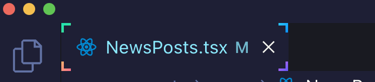 Hình minh họa
:root{
--size: 5px;
}
.monaco-workbench
 .part.editor
 > .content
 .editor-group-container
 > .title
 .tabs-container
 > .tab.active.tab-border-top
 > .tab-border-top-container {
 width: 100%;
 height: 100%;
 top: 0;
 left: 0;
 background-color: transparent;
}
.monaco-workbench
 .part.editor
 > .content
 .editor-group-container
 > .title
 .tabs-container
 > .tab.active.tab-border-top
 > .tab-border-top-container:before,
 .monaco-workbench
 .part.editor
 > .content
 .editor-group-container
 > .title
 .tabs-container
 > .tab.active.tab-border-top
 > .tab-border-top-container:after {
 content: "";
 width: var(--size);
 height: var(--size);
 position: absolute;
 border: 2px solid;
 border-image-slice: 1;
}
.monaco-workbench
 .part.editor
 > .content
 .editor-group-container
 > .title
 .tabs-container
 > .tab.active.tab-border-top
 > .tab-border-top-container:before {
 top: 0;
 left: 0;
 border-right: 0;
 border-bottom: 0;
 border-image-source: linear-gradient(-45deg, #4dd78a, #20e3b2);
}

.monaco-workbench
 .part.editor
 > .content
 .editor-group-container
 > .title
 .tabs-container
 > .tab.active.tab-border-top
 > .tab-border-top-container:after {
 right: 0;
 bottom: 0;
 border-top: 0;
 border-left: 0;
 border-image-source: linear-gradient(-45deg, #6a5af9, #d66efd);
}
.monaco-workbench
 .part.editor
 > .content
 .editor-group-container
 > .title
 .tabs-container
 > .tab.active:before,
 .monaco-workbench
 .part.editor
 > .content
 .editor-group-container
 > .title
 .tabs-container
 > .tab.active:after {
 content: "";
 width: var(--size);
 height: var(--size);
 position: absolute;
 border: 2px solid;
 border-image-slice: 1;
}
.monaco-workbench
.part.editor
 > .content
.editor-group-container
 > .title
.tabs-container
 > .tab.active:before {
 left: 0;
 bottom: 0;
 border-top: 0;
 border-right: 0;
 border-image-source: linear-gradient(-45deg, #fc6c8f, #ffb86c);
}

.monaco-workbench
 .part.editor
 > .content
 .editor-group-container
 > .title
 .tabs-container
 > .tab.active:after {
 top: 0;
 right: 0;
 border-left: 0;
 border-bottom: 0;
 border-image-source: linear-gradient(-45deg, #098dff, #2cccff);
}
Các bạn thấy là code rất là dài đúng không ? Mình nghiên cứu và làm ra đấy. Một lưu ý là đôi khi các bạn áp dụng vào nó không ra kết quả giống hình minh họa vì khác theme thì class nó sẽ khác, ở video ở trên có chỉ chi tiết rồi, các bạn tự tìm ra class tương ứng và áp dụng code styles mình chia sẻ là sẽ được thôi nhen.
Tùy biến active tab line gradient
Sử dụng đoạn code này thì khi active tab sẽ có một đường line ở trên cái tab khi mà nó active trong VSCode và nó sẽ chạy qua chạy lại với nhiều màu sắc cho các bạn
.monaco-workbench
  .part.editor
  > .content
  .editor-group-container
  > .title
  .tabs-container
  > .tab.active.tab-border-top
  > .tab-border-top-container {
  background-size: 400% 400%;
  background-image: linear-gradient(
    -45deg,
    #fc6c8f,
    #ff2ced,
    #ffb86c,
    #2cccff,
    #20e3b2,
    #ffcc70,
    #c850c0,
    #4158d0
  );
  animation: gradient 5s ease alternate infinite;
  height: 3px;
}
@keyframes gradient {
  0% {
    background-position: 0% 50%;
  }
  50% {
    background-position: 100% 50%;
  }
  100% {
    background-position: 0% 50%;
  }
}
Tùy biến font chữ cho các class
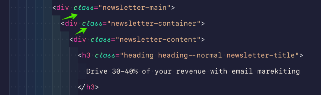 Hình minh họa
Nhiều bạn hỏi mình sao làm cho chỗ này nó có font chữ khác thì mình cũng chia sẻ cho các bạn luôn. Đầu tiên các bạn cần tải font Dank Mono và cài đặt cho máy tính của các bạn tại đây
Sau khi tải và cài đặt xong cho máy tính rồi thì áp dụng đoạn code này vào là được
.mtk5,
.mtk26 {
 -webkit-font-smoothing: auto;
 font-family: "Dank mono", monospace;
}
.mtk26 {
 font-style: italic;
}
Hãy lưu ý rằng hai class .mtk5 và .mtk26 là tương ứng cho theme mình đang xài (Evondev Dracula), nếu các bạn xài theme khác thì tự tìm class nhé vì mỗi theme thì class nó khác nhau. Tìm như thế nào thì coi video ở trên cùng. Mình đã chỉ tận răng rồi cho nên mấy vấn đề này mình không có hỗ trợ riêng đâu nhé.
Dành cho ai dùng theme Evondev Dracula
Thì đây là toàn bộ code tùy biến hiện tại của mình, nếu bạn thích thì có thể copy vào hết là y hệt mình, tuy nhiên nếu bạn đang dùng máy có độ phân giải cao thì nó sẽ đẹp hơn nhé, ví dụ như Macbook chẳng hạn
:root {
 --gradient-dir1: to top right;
 --gradient-dir2: to bottom left;
 --gradient-dir3: to right top;
 --gradient-dir4: to left bottom;
 --gradient-dir5: to top left;
 --size: 5px;
}
.mtk10,
.mtk15 {
 color: transparent;
 background-image: linear-gradient(var(--gradient-dir4), #fc806c, #ff1bd1);
 -webkit-background-clip: text;
 background-clip: text;
 -webkit-text-fill-color: transparent;
}

.mtk5,
.mtk26 {
 color: transparent;
 background-image: linear-gradient(
 var(--gradient-dir1),
 #4dd78a,
 #20e3b2,
 #a2de6a
 );
 background-clip: text;
 -webkit-text-fill-color: transparent;
 -webkit-background-clip: text;
 -webkit-font-smoothing: auto;
 font-family: "Dank mono", monospace;
 font-size: 14px;
}
.mtk26 {
 background-image: linear-gradient(
 var(--gradient-dir5),
 #4dd78a,
 #20e3b2,
 #a2de6a
 );
 font-style: italic;
}
.mtk23,
.mtk16 {
 color: transparent;
 background-image: linear-gradient(var(--gradient-dir1), #d66efd, #6a5af9);
 background-clip: text;
 -webkit-text-fill-color: transparent;
 -webkit-background-clip: text;
}
.mtk9,
.mtk17 {
 color: transparent;
 background-image: linear-gradient(
 var(--gradient-dir2),
 #098dff,
 #2cccff,
 #2979ff
 );
 background-clip: text;
 -webkit-text-fill-color: transparent;
 -webkit-background-clip: text;
}
.mtk18 {
 color: transparent;
 background-image: linear-gradient(var(--gradient-dir2), #b0beff, #fed9ff);
 background-clip: text;
 -webkit-text-fill-color: transparent;
 -webkit-background-clip: text;
 font-style: normal;
}
.mtk3 {
 color: transparent;
 /* background-image: linear-gradient(
 var(--gradient-dir1),
 #c29ffd,
 #ffb4dc,
 #e39bf7
 ); */
 background-image: linear-gradient(to top, #fce1d0, #ffadd6, #e39bf7);
 background-clip: text;
 -webkit-text-fill-color: transparent;
 -webkit-background-clip: text;
}
.mtk7 {
 color: transparent;
 background-image: linear-gradient(var(--gradient-dir2), #fc6c8f, #ffb86c);
 -webkit-background-clip: text;
 background-clip: text;
 -webkit-text-fill-color: transparent;
}
.mtk8,
.mtk14 {
 color: transparent;
 background-image: linear-gradient(to right, #ffb88c, #eac394);
 -webkit-background-clip: text;
 background-clip: text;
 -webkit-text-fill-color: transparent;
}

.monaco-workbench
 .activitybar
 > .content
 :not(.monaco-menu)
 > .monaco-action-bar
 .action-item.checked
 .active-item-indicator:before {
 border: 0;
 width: 3px;
 height: 100%;
 position: absolute;
 top: 0;
 left: 0;
 background-image: linear-gradient(45deg, #fc6c8f, #ff2ced);
}

.monaco-workbench
 .activitybar
 > .content
 :not(.monaco-menu)
 > .monaco-action-bar
 .badge
 .badge-content {
 background-image: linear-gradient(45deg, #fc6c8f, #ff2ced);
}
.monaco-editor .cursors-layer .cursor {
 background-image: linear-gradient(to top, #6a5af9, #d66efd, #fc6c8f, #ff2ced);
}

.mtki {
 font-style: normal;
}

.monaco-workbench
 .part.editor
 > .content
 .editor-group-container
 > .title
 .tabs-container
 > .tab.active.tab-border-top
 > .tab-border-top-container {
 width: 100%;
 height: 100%;
 top: 0;
 left: 0;
 background-color: transparent;
}
.monaco-workbench
 .part.editor
 > .content
 .editor-group-container
 > .title
 .tabs-container
 > .tab.active.tab-border-top
 > .tab-border-top-container:before,
 .monaco-workbench
 .part.editor
 > .content
 .editor-group-container
 > .title
 .tabs-container
 > .tab.active.tab-border-top
 > .tab-border-top-container:after {
 content: "";
 width: var(--size);
 height: var(--size);
 position: absolute;
 border: 2px solid;
 border-image-slice: 1;
}
.monaco-workbench
 .part.editor
 > .content
 .editor-group-container
 > .title
 .tabs-container
 > .tab.active.tab-border-top
 > .tab-border-top-container:before {
 top: 0;
 left: 0;
 border-right: 0;
 border-bottom: 0;
 border-image-source: linear-gradient(-45deg, #4dd78a, #20e3b2);
}

.monaco-workbench
 .part.editor
 > .content
 .editor-group-container
 > .title
 .tabs-container
 > .tab.active.tab-border-top
 > .tab-border-top-container:after {
 right: 0;
 bottom: 0;
 border-top: 0;
 border-left: 0;
 border-image-source: linear-gradient(-45deg, #6a5af9, #d66efd);
}
.monaco-workbench
 .part.editor
 > .content
 .editor-group-container
 > .title
 .tabs-container
 > .tab.active:before,
.monaco-workbench
 .part.editor
 > .content
 .editor-group-container
 > .title
 .tabs-container
 > .tab.active:after {
 content: "";
 width: var(--size);
 height: var(--size);
 position: absolute;
 border: 2px solid;
 border-image-slice: 1;
}

.monaco-workbench
 .part.editor
 > .content
 .editor-group-container
 > .title
 .tabs-container
 > .tab.active:before {
 left: 0;
 bottom: 0;
 border-top: 0;
 border-right: 0;
 border-image-source: linear-gradient(-45deg, #fc6c8f, #ffb86c);
}

.monaco-workbench
 .part.editor
 > .content
 .editor-group-container
 > .title
 .tabs-container
 > .tab.active:after {
 top: 0;
 right: 0;
 border-left: 0;
 border-bottom: 0;
 border-image-source: linear-gradient(-45deg, #098dff, #2cccff);
}
Tạm kết
Trên đây là toàn bộ source code tùy biến hiện tại của mình. Hi vọng bài viết ngắn gọn súc tích này sẽ có ích cho các bạn. Giúp các bạn có cảm hứng khi coding hơn.
Bài viết gốc được đăng tải tại evondev.com
Xem thêm:
- Tổng hợp CSS tips tricks hay mà có thể bạn chưa biết
- Những cuốn sách mà Developer nên đọc – Phần 1
- Thành thạo kỹ năng CSS của bạn với bộ code cực chất
Việc làm cho Front-end Developer mới nhất trên TopDev, ứng tuyển ngay!
- T Thoughtworks: Nơi công nghệ chạm đích đến
- Đ Đại dương xanh cho Doanh nghiệp tăng trưởng bền vững trên Zalo
- L Lakehouse Architecture: Nền tảng dữ liệu cho ứng dụng AI trong tương lai
- G Giải Quyết Bài Toán Kinh Doanh Bằng Big Data và AI
- B BenQ RD Series – Dòng Màn Hình Lập Trình 4k+ Đầu Tiên Trên Thế Giới
- F Framework nào tốt nhất cho dự án của bạn? – Checklist chi tiết
- K Kinh nghiệm xử lý responsive table hiệu quả
- S Stackoverflow là gì? Bí kíp tận dụng Stack Overflow hiệu quả
- 7 7 kinh nghiệm hữu ích khi làm việc với GIT trong dự án
- B Bài tập Python từ cơ bản đến nâng cao (có lời giải)